


What have Skype, Facebook, Twitter, LinkedIn, and WordPress all have in common?
The colour of their logo.
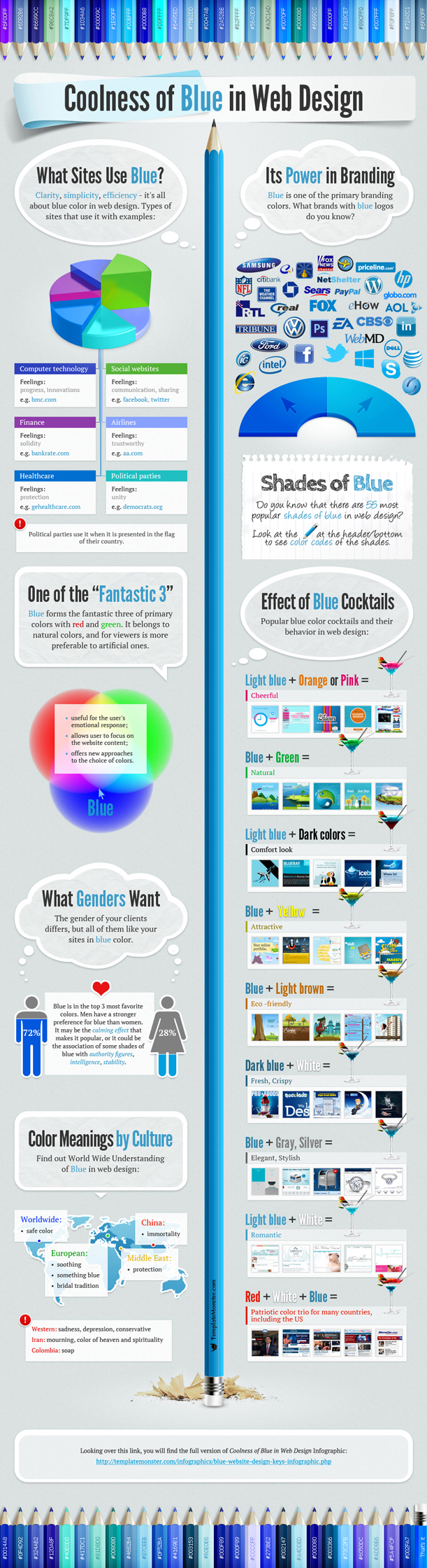
So why blue?
Research shows that the universal colour has a calming effect. Many associate Blue with good qualities such as clean, professional, and trustworthy. Just about any business would want their logo to portray such worthy traits.
But is every variety of blue as effective?
This infographic from TemplateMonster breaks down the industries that use the Blue -with hints for picking the right blue for you:
But why?
According to the Wikipedia article on logo design:
“Color is considered important to brand recognition, but it should not be an integral component to the logo design, which could conflict with its functionality. Some colors are formed/associated with certain emotions that the designer wants to convey. For instance loud primary colors, such as red, are meant to attract the attention of drivers on highways are appropriate for companies that require such attention. In the United States red, white, and blue are often used in logos for companies that want to project patriotic feelings. Green is often associated with the health and hygiene sector, and light blue or silver is often used to reflect diet foods. For other brands, more subdued tones and lower saturation can communicate reliability, quality, relaxation, or other traits.”
Final Thoughts…
A Quora thread with some answers!
-
Humans have evolved to see red and green effectively, red and yellows can be signals of danger.
-
Others use blue, so that’s why so many companies use blue.
-
Blue is a majority of people’s favourite colour.
-
Psychologically it’s calming and inoffensive.
-
Blue hue offers more diversity changes.
You might also enjoy:
This weeks TOP 5 logos selected by the Logosea team. (08.07.2016)
5 good reasons to change your logo
40 Must See TED Talks about Creativity and Design
Know The Principles of Effective Logo Design
Knock yourselves out using our FREE: LOGO & BUSINESS CARD Online design tool.